Hi, it’s me, Tyler D. Coin collecting has been a passive interest of mine since high school, but recently I’ve gotten more into it… I’ve probably got a few hundred dollars invested into it by this point, so I figure, why not write about coins? It’s always good to have knowledge about the things you’re collecting. Also, my earliest public posts were about historical topics of personal interest, so this doubles as a return to form of sorts. Who knows? Maybe going full circle is the secret to getting me out of this writing rut.
(hehe… circle… ’cause coins are circula-)
Today, I’m only going to cover normal Canadian coins. No commemorative designs, special editions, foreign doubloons or bullion. This post would be way too long if I delved too far into those. I’ll probably also cover Canadian bills at some point, but anything else will depend on how this post goes.
Penny
1858 to 2012
First up, the 1-cent piece, aka the Penny. One of four coins introduced in 1858, this copper beauty is the starting mark of our currency.
Originally, it was exactly 1 inch (2.54 cm) wide! It shrank to a more reasonable size in 1920 and got a redesign by Fred Lewis. The design you’re probably more familiar with, however, came around in 1937 with English artist G. E. Kruger-Gray’s twig leaf design.
Sadly, the Penny is no longer around. Even after switching from near-pure copper to copper plating in 1997, the cost of production overtook the value of the coin, so it was retired in 2012. Rest in Piece, Penny, you will be missed.
(…oh no… I just realized there’ll probably be a point in time when the younger generations don’t know what this coin is… help, I don’t wanna feel old, I’m not ready for-)
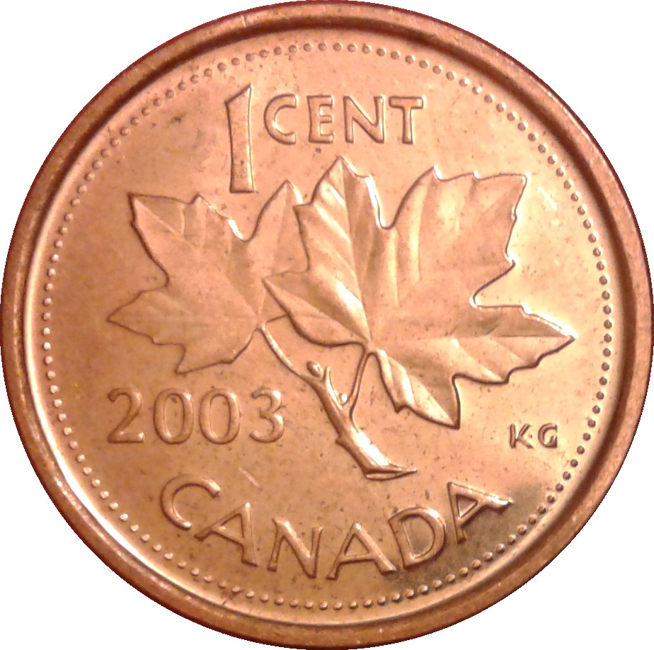


Fun Fact – The Maple Leaf is the longest-lasting symbol on Canadian coins. It was a prominent feature on the Penny every year except the special 1967 run, and even after the coin’s discontinuation in 2012, the maple leaf remains present on the Nickel, and within the security markings of modern Loonies and Toonies.
Nickel
1858 to Present
Here we have the humble 5-cent piece, the Nickel. Witness the hard-working beaver, building its dam. You could say that this design (also by G. E. Kruger-Gray) is representative of the Canadian spirit. We may not be as flashy as our downstairs neighbors, but when push comes to shove, we’ll get things done.
The Nickel was a different size as well, back before W.H.J. Blackmore’s redesign in 1920. It used to be very smol, even more so than the Dime, and was affectionately nicknamed fish-scales. But that’s not the only thing about this coin that’s changed over the years…


Fun Fact – This coin’s metal composition has changed 11 times, the most of any Canadian coin. It started life as a silver coin, then shifted to nickel (hence the coin’s namesake). Raw nickel was needed for the war effort in WW2 and Korea, so the Royal Canadian Mint improvised with tombac brass and, later, steel. Rising nickel prices later made pure nickel coins too expensive to produce, so they were mixed with copper and then finally phased out in favor of nickel plating. If you find a pre-1982 Nickel, consider yourself lucky, because a lot of them were melted down for materials.
Dime
1858 to Present
Next up is the 10-cent piece, the Dime. Despite the long history behind it, it hasn’t changed much. It’s honestly impressive, how consistent this little thing is.
The standard design changed once, in 1937, to Emanuel Hahn’s Bluenose illustration. It’s the smallest coin, and the diameter also only changed once in 1968… shrinking by 4 micrometers. For reference, that’s about the width of a spider’s thread. It was made mostly of silver until 1968, when it became almost pure nickel, then steel with nickel plating in 2000. Ironically, between 1982-1999, the Dime contained more nickel than the actual Nickel.


Fun Fact – This is the only modern coin without a single animal on it. The Bluenose, the ship depicted on the coin, was a renowned Nova Scotian schooner. She was built for fishing and racing, and won several high-profile tournaments against rival American vessels. She met her end in 1946, in a collision with a reef while delivering bananas in the Caribbean. No, I will not elaborate.
Quarter
1870 to Present
While not the most visually impressive of the Canadian coins, the Quarter is certainly not a coin to be overlooked. A very useful coin for daily interactions, it’s hard to imagine life without it.
Emanuel Hahn (the same guy behind the Bluenose design) created the caribou portrait. It’s simple, yet memorable, and a fitting symbol of our country’s natural diversity. Good luck finding one dated older than 1969, though. Old Quarters are highly sought-after by collectors, as their high silver content makes them quite valuable.
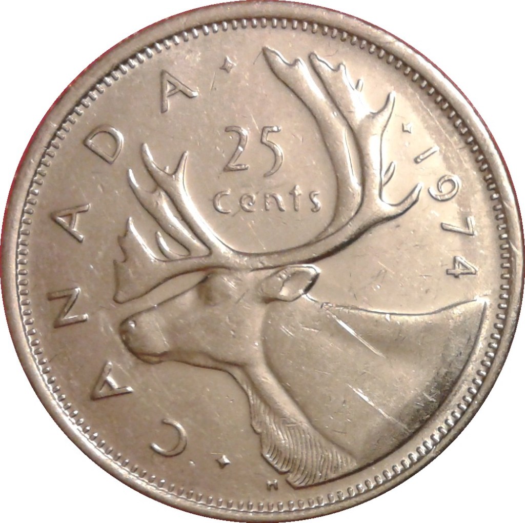
Fun Fact – When it comes to alternative designs, it’s hard to beat the Quarter. There’s over 90 different commemorative quarters to find, according to Wikipedia, with millions of each existing out in the wild. It’s a great starting point for collectors!
20 Cent
1858
“Hey, wait a minute, you said there were four coins introduced in 1858. I only counted three.” Indeed I did. The Royal Mint of London (Canada was still in the British Empire at the time) also tried to introduce a 20-cent coin to Canada. However, it was very easy to confuse it with other existing coins, and it was discontinued that same year, in favor of Canada following the USA’s example with the Quarter.

50 Cent
1870 to Now
If you’ve never seen this coin before either, you’re probably not alone. It doesn’t even have a nickname, it’s just called the 50-Cent coin. While it’s still legal currency, it was never widely accepted by the public, and nowadays it’s mostly just seen as a collector’s item.
Personally, I can see why it never caught on. The design is very… packed, shall we say, and it’s too similar to the Quarter in both shape and monetary value. Still though, it’s a neat thing to have, even if only for the novelty.

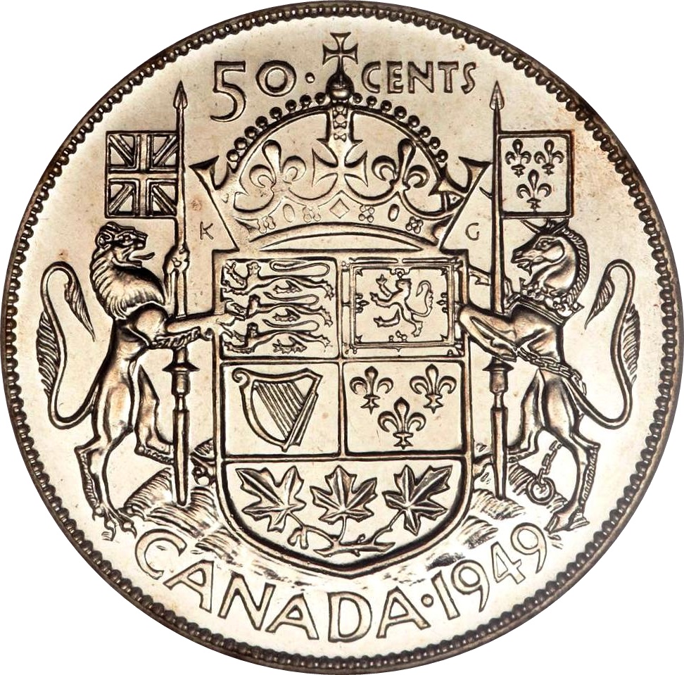

Fun Fact – This is the only standard Canadian coin with Latin text on its reverse (tails) side. The lower banner, added in 1959, reads “A Mari usque ad Mare” (From Sea to Sea), while the Order of Canada’s motto “Desiderantes meliorem patriam” (They desire a better country) was added to the central ring in 1994.
Dollar
1935 to 1987 / 1987 to Now
Ah, the Loonie. A more recent addition to the Canadian currency family, this coin was released in 1987 to phase out 1 dollar bills with something more durable, and Robert-Ralph Carmichael’s loon illustration promptly earned the coin a fitting nickname. It’s also 11-sided, making the Loonie the only non-circular Canadian coin (though it should be noted that the Penny and Nickel were once 12-sided, albeit for different reasons).
Before the iconic Loonie, however, there was another $1 coin: the Voyageur Dollar. Measuring 2.84 mm thick and almost a full cm wider than its successor, this coin is an absolute unit to behold, and I personally love it. Due to its absurdly large size, however, it never really caught on, with people preferring the lighter paper bill.


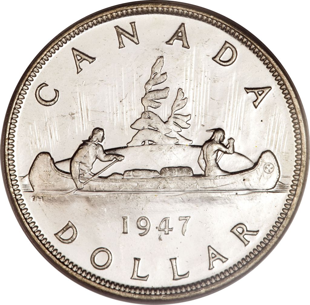
Fun Fact – The debuts of both these coins suffered from issues. The Voyageur Dollar was supposed to come out in late 1910, but production issues delayed the shipment of necessary machine parts until after the 1911 election, at which point their production was cancelled by Sir Robert Borden, Canada’s 8th Prime Minister. Only 3 from 1911 are known to exist, and it wasn’t until 1935 that the coins saw a proper release. As for the Loonie… it was originally supposed to inherit the Voyageur imagery, but the new die-casts somehow got lost in the mail, so the design had to be revised over security concerns.
Toonie
1996 to Now
Last but not least, we have the newest member of the family: the 2 dollar coin. Like the Loonie, it was introduced to phase out the 2-dollar bill. People quickly nicknamed it the Toonie, because portmanteaus are fun.
The polar bear was designed by Canadian artist Brent Townsend. The 2012 update features laser engravings, as a means of combatting counterfeits (such as the camel-toed bear and the hilarious Z Dollard). The Toonie also has some cool-looking colored designs, including the black-ringed Solemn Tribute to the Queen and the glow-in-the-dark Dance of the Spirits. Some sites say it’s the first ever glow-in-the-dark coin, but I couldn’t find a reliable source to back that claim up, so take it with a grain of salt.

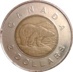
Fun Fact – The Toonie, Canada’s only bi-metallic coin, is also the only modern Canadian coin with no American equivalent.
All images in this post are sourced from Numista, and the information is (mostly) sourced from the Royal Canadian Mint.
